
Anthracite
Developing the brand identity for an elegant and seductive new martini lounge located within the iconic Great Northern Hotel in Kings Cross.
-
London’s landmark Great Northern Hotel (GNH) enlisted us to create the name, identity, brand collateral and website for its luxury new martini lounge.
The sophisticated new bar was to add a layer of seductive glamour to the timelessly elegant hotel. The ambition was to draw new visitors including local business people, hotel residents and pre-dinner guests. The destination bar had to be somewhere you would feel equally comfortable meeting a business contact or a lover; the ideal location for an intimate tête-a-tête.
The first challenge was to define the name. It had to feel evocative and intriguing; relevant to its locale but not obvious. As one of the greatest Victorian railway hotels, GNH is steeped in local history. ‘Anthracite’ was chosen for its intrigue and depth of meaning. While anthracite is known as a colour, it is also a high-quality coal. In the golden age of steam, anthracite was used to fuel locomotive engines. At Kings Cross, it conjures up the original romance and excitement of rail travel.
Anthracite Martini Lounge is a place where business and pleasure mix – from mid-morning until very late. Fittingly, martinis take centre stage alongside a decadent menu of caviar, charcuterie and cheese boards.
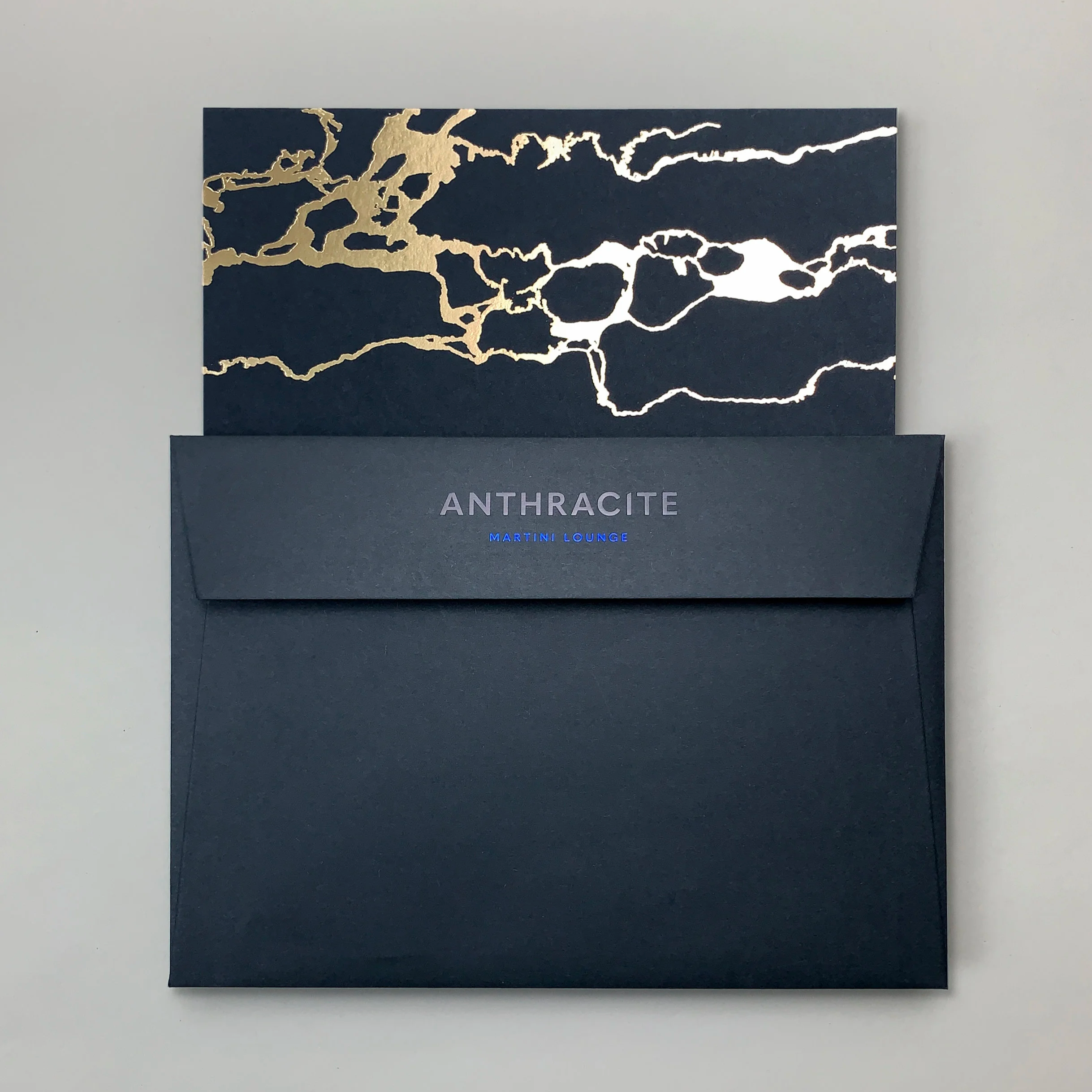
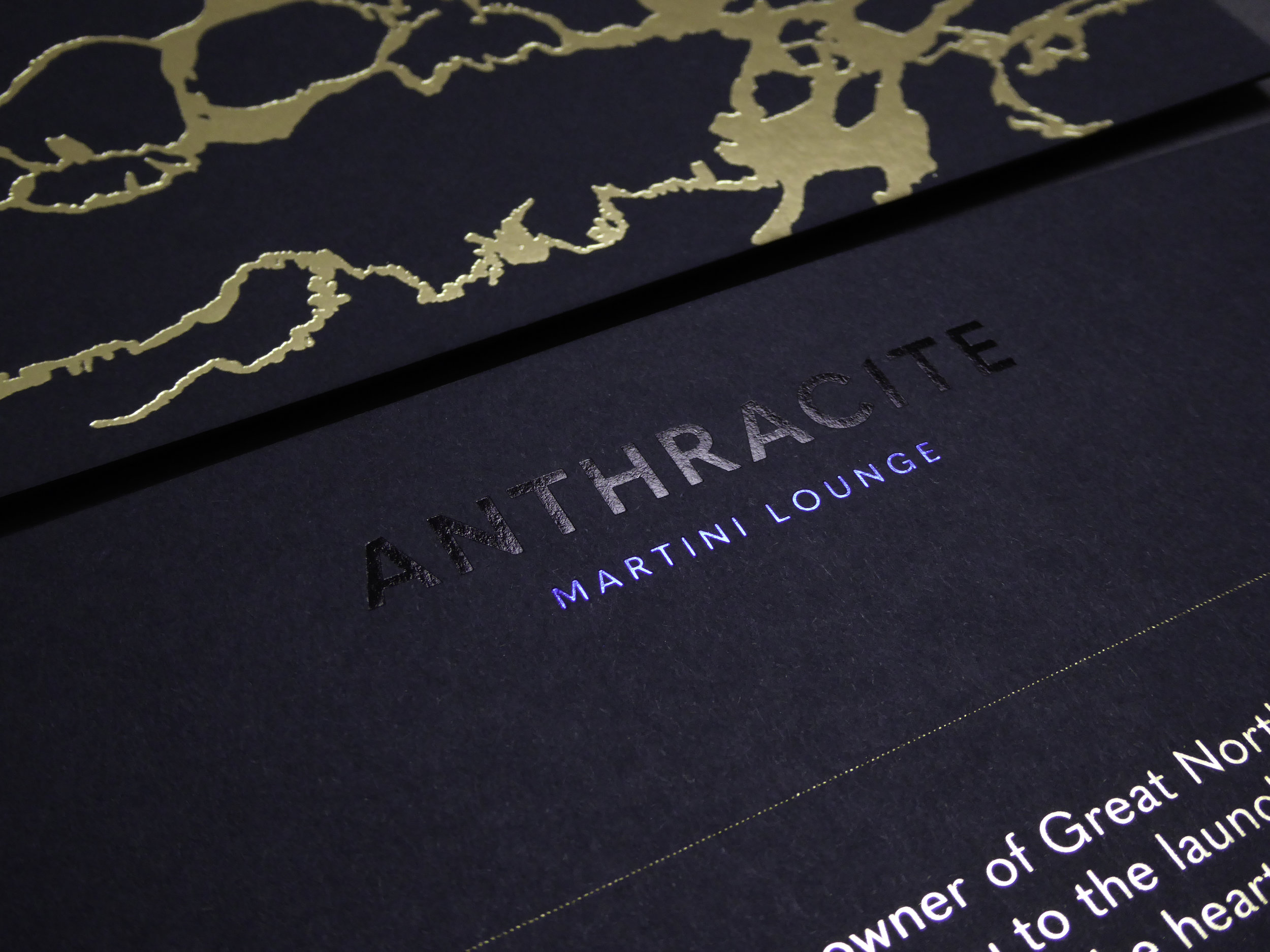
The brand expression is inspired by the passive and active attributes of anthracite. In its raw state the material is near-black with a submetallic lustre. With the fewest impurities of any coal, it burns hotter with an intense blue flame and long-lasting heat. The branding reflects this smouldering tension, combining a timeless elegance with a darker edge of seductive glamour. It’s vibrant and tactile, passionate and spirited; suggestive of sophisticated indulgence with a touch of subversion.
The brand palette expertly combines matte on gloss, textured and smooth materials to convey the material’s abstract qualities. Dark charcoal greys, navy, matte and gloss black are enhanced with submetallic details, shot through with an invigorating electric blue. Gold touches and marble textures echo the luxury elegance of the bar’s interior.
The logo conveys a simple, contemporary edge, with characters subtly crafted and ‘cut’ to represent anthracite’s asymmetric beauty. The brand typeface, Quasimoda, combines modern geometric forms with classical proportions and a slightly antiquated flair, suited to the Grade II-listed location.
Collaboration was key throughout the project. As Anthracite’s brand guardians, we designed and managed the website build in partnership with b32, advised upon and helped source glassware, tableware and uniforms, and managed the print and signage production. We are now working with the client’s PR agency to manage the marketing and PR drive.
Disciplines
Brand Strategy
Naming
Brand Identity
Graphic Design
Signage & Wayfinding
Art Direction
Website
Client
Great Northern Hotel
Sector
Hospitality
Food & Beverage


“ There is something pleasingly behind-closed-doors about this welcome new pre-dinner drinking den.”
—
Conde Nast Traveller


As described by The Sunday Times, “like a good martini, Anthracite not only looks but feels expensive.”
