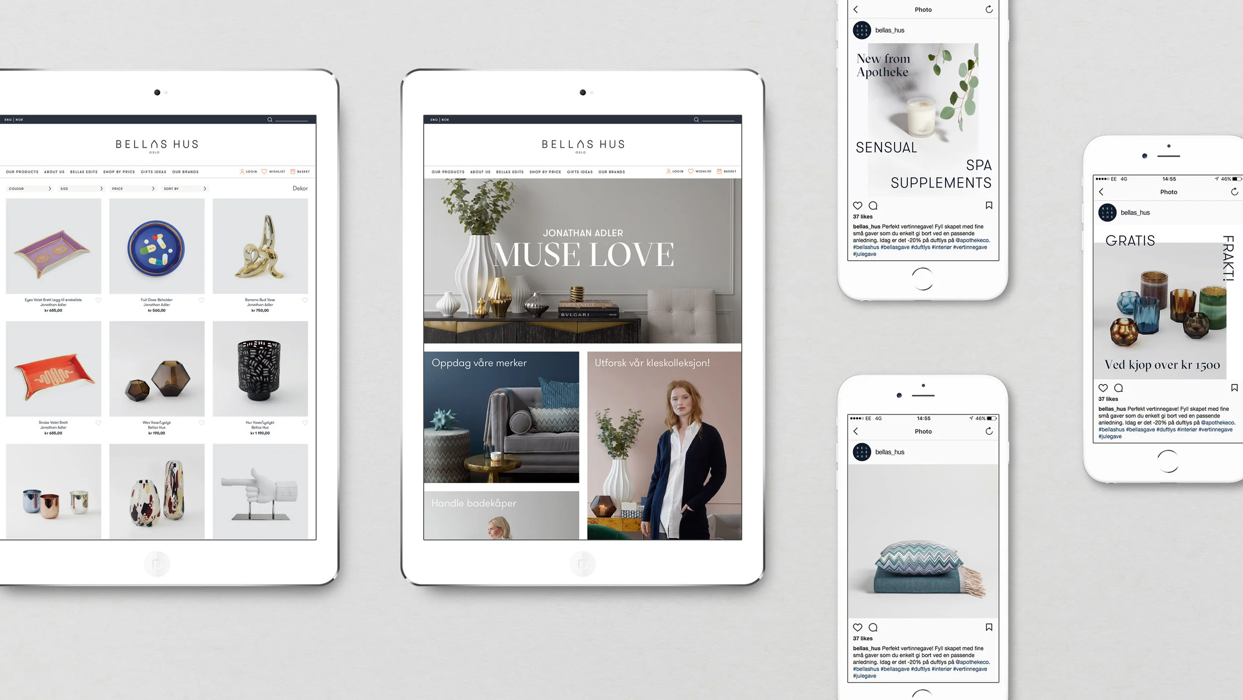
Dark navy was chosen as the brand’s signature colour. Acting as a powerful ‘neutral’, it creates a distinctive backdrop for Bellas Hus’ curated collection. Just one typeface, GT Walsheim, is used throughout the branding to enhance the simple, understated personality.
A new rectangular brand marque acts as a seal, with the ‘A’ of Bellas Hus resembling a gabled Norwegian house. The marque is used to form a playful pattern, and as a logo for Bellas Hus’ own label – which includes loungewear, bedding, spa candles, linen and throws.
The packaging reflects the quality and simplicity of Bellas Hus products. Minimal, clean outer layers contrast with luxe, unexpected details like copper eyelets and bold pattern tissue paper. Hand-drawn patterns introduce edginess and personality.


